Home Dashboard
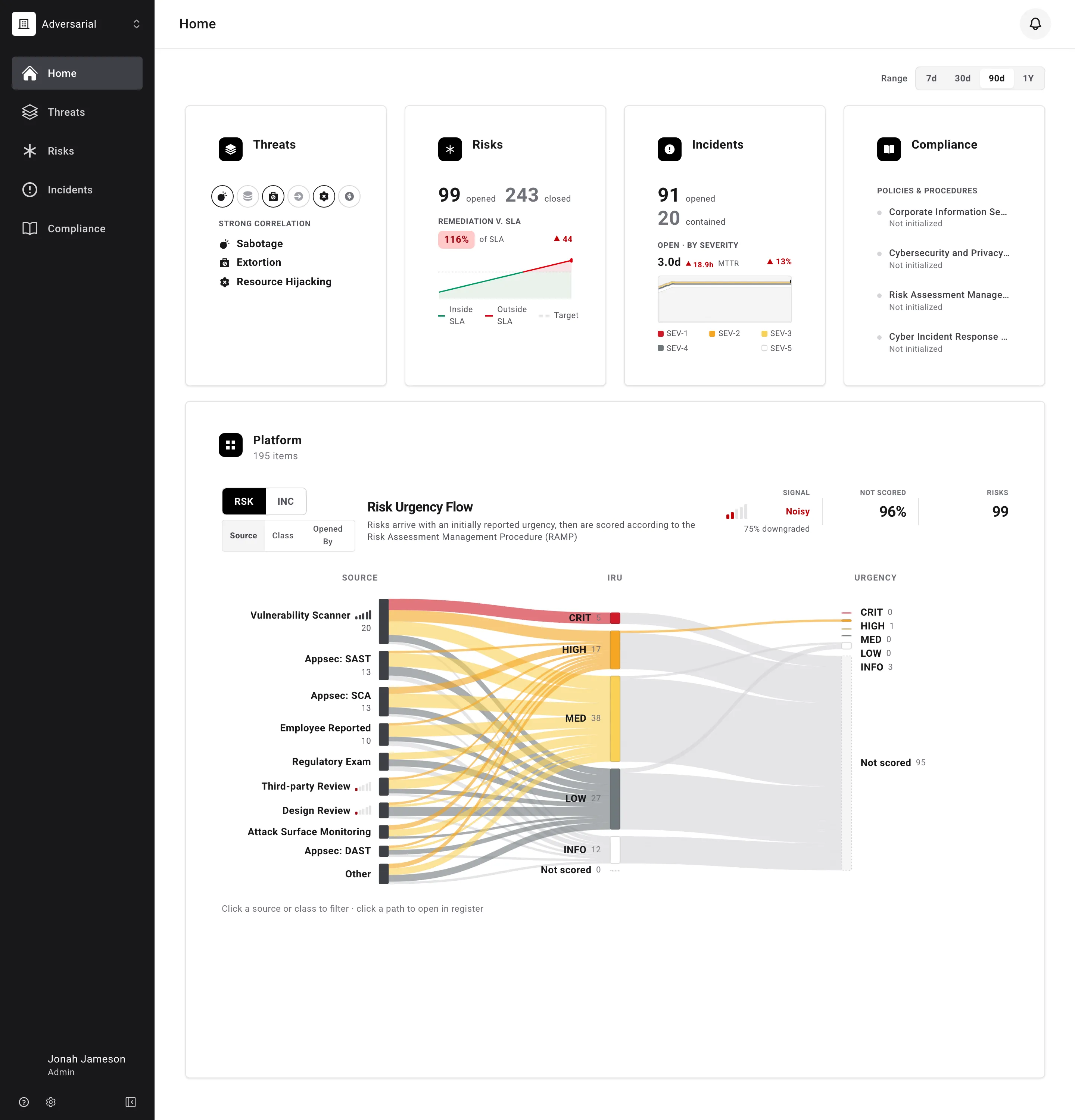
The Home page is the landing dashboard of the Adversarial platform. It provides an at-a-glance view of your organization’s security posture across the four core modules — Threats, Risks, Incidents, and Compliance — for a reporting window you control with the date range selector.
Date Range Selector
Section titled “Date Range Selector”The Range selector on the right side of the dashboard scopes the Risks and Incidents cards and the Platform flow charts. The Threats and Compliance cards always show current state. Choose between:
- 7d — the last 7 days
- 30d — the last 30 days
- 90d — the last 90 days
- 1Y — the last year
Days are counted in your own time zone, with day boundaries at your midnight, so what the dashboard counts lines up with the dates shown in the registers.
Two things happen when you change the range:
- Counts are scoped to the window. Opened counts include every risk whose Discovered Date — and every incident whose Detected Date — falls within the selected range, whether or not it has since been closed. Closed and contained counts include records closed or contained within the range. The Remediation v. SLA figure is the exception: it always reads the whole open backlog, because an overdue risk is overdue whatever range you pick.
- Change indicators recalculate. Timing metrics like MTTR compare the selected window against the window of the same length immediately before it — a 30-day view compares against the prior 30 days, and so on. The trend deltas on the Risks and Incidents charts instead measure movement from the start of the selected window to its end. Hover any delta to see exactly which comparison it uses.
Summary Cards
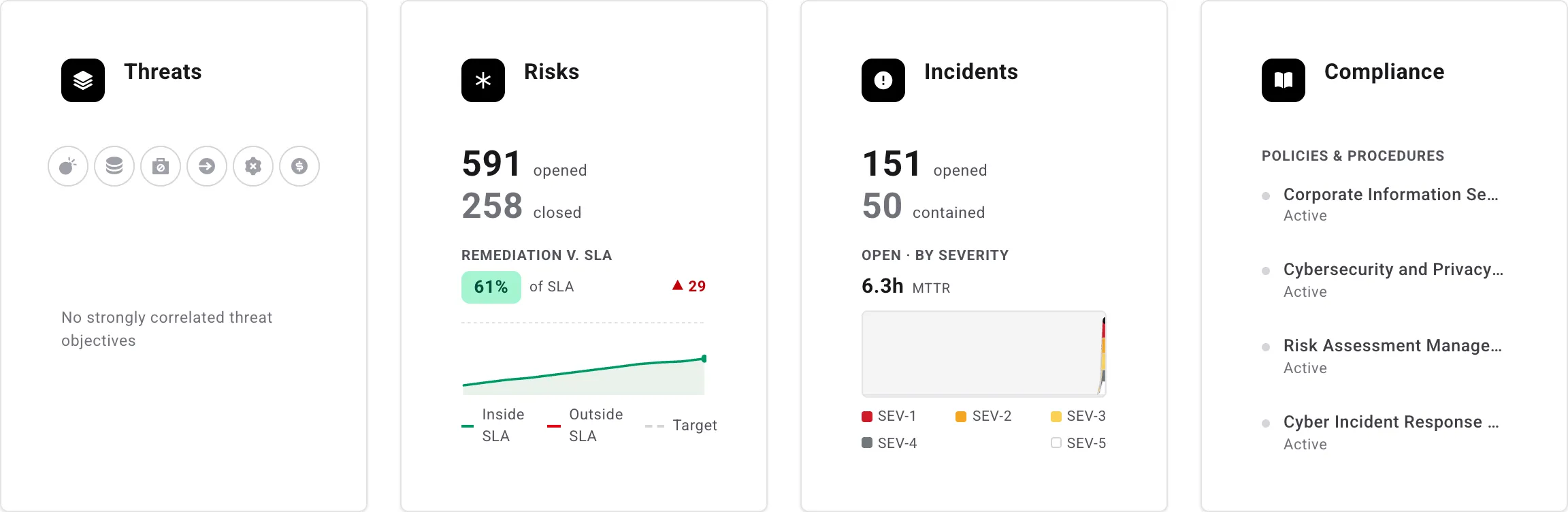
Section titled “Summary Cards”Four summary cards sit at the top of the dashboard, one for each module. Each card shows live data for the selected date range, and card headings link into the corresponding module so you can jump straight from a number to the records behind it.
Filtering a card
Section titled “Filtering a card”The Risks and Incidents cards can each be narrowed to specific bands: open the menu in the card’s top-right corner and choose which urgency bands (Risks) or severity bands (Incidents) to include — plus Not Scored for records with no score yet. The bands don’t need to be contiguous. The selection reshapes everything on the card — the counts, the Remediation v. SLA sparkline, the severity timeline, and MTTR — and carries through when you click a count into the register, so the register shows exactly the records behind the filtered number. Each card’s selection is independent of the other card and of the register’s own filters.
Threats
Section titled “Threats”The Threats card shows all six threat objectives, shaded by how strongly each is weighted in your Threat Profile, and spells out the ones at strong correlation. It reads the Threat Profile alone — your risks and incidents do not feed it. When a Threat Profile proposal is awaiting a decision, the card says Proposal under review; when no objective is strongly correlated, the card says so.
The Risks card tracks the health of your risk register for the selected range:
- Opened — risks with a Discovered Date inside the selected range, whether or not they have since closed. Click the count to open the risk register filtered to exactly those records.
- Closed — risks closed inside the selected range, by Closed Date. Also clickable.
- Remediation v. SLA — how remediation is tracking against the SLA window for each urgency level, explained below.
Remediation v. SLA
Section titled “Remediation v. SLA”Every scored risk carries a remediation SLA based on its urgency, and its Due Date marks the end of that window (see Urgency for how the two are derived). The windows are defined in the Risk Assessment Management Procedure (RAMP):
| Urgency | Remediation SLA | Due Date |
|---|---|---|
| Critical | 30 days | Discovered Date + 30 days |
| High | 60 days | Discovered Date + 60 days |
| Medium | 180 days | Discovered Date + 180 days |
| Low | 365 days | Discovered Date + 365 days |
| Info | None | Not set |
The Remediation v. SLA panel reads your register against those windows in three ways.
The percentage is the average share of the SLA remediation window consumed across your scored risks — in other words, how far into their allowed remediation time your risks are, on average. Lower is better:
- A risk halfway through its window contributes 50%, a risk exactly at its Due Date contributes 100%, and an overdue risk contributes more than 100%.
- For example, a Critical risk 15 days into its 30-day window (50%) averaged with a High risk 45 days into its 60-day window (75%) gives 63% of SLA.
- The badge is green at or below 100% — remediation is, on average, inside its deadlines. Above 100% it turns red: the average risk is past its Due Date.
Risks without an urgency score have no SLA window and are not counted.
The points delta next to the percentage measures how the average moved across the selected range, in percentage points — the value on the last day of the range compared with the first day. It is not a count of risks. A green ▼ means average SLA consumption fell (improving); a red ▲ means it rose. For example, a range that starts at 104% of SLA and ends at 21% shows ▼ 83 — consumption fell 83 points. The delta only appears when the average moved by at least a full point.
The trend chart plots that same average day by day across the selected range:
- Target — the dashed line at 100%, the point at which risks would, on average, exactly exhaust their SLA windows. Staying below it is the goal.
- Inside SLA — the line renders green wherever the daily average sits at or below the Target: the average open risk is within its remediation window.
- Outside SLA — the line renders red wherever the daily average sits above the Target: risks are, on average, past their Due Dates.
The dot at the end of the line marks the most recent value, and hovering anywhere on the chart shows the exact of SLA percentage for that day.
Incidents
Section titled “Incidents”The Incidents card tracks incident volume and response performance for the selected range:
- Opened — incidents with a Detected Date inside the selected range, whatever their status now. Click the count to open the incident register filtered to exactly those records.
- Contained — incidents contained inside the selected range, by Contained Date. Also clickable.
- Open · By Severity and MTTR — the open backlog and response-time metrics, explained below.
Open · by severity
Section titled “Open · by severity”The timeline charts the daily count of incidents open during the selected range, stacked by severity — each day’s column height is the total number of open incidents that day, layered from SEV-1 (Critical, red) down to SEV-5 (Informational). The SEV-1 through SEV-5 legend below the chart is the color key for those layers. Incidents that have not yet been scored form an additional unlabeled band at the top of each column, so they count toward the day’s total.
Reading the chart:
- A rising timeline means incidents are being opened faster than they are contained — the backlog is growing. A falling timeline means the team is working the backlog down.
- Hover anywhere on the chart to read the exact date and count — the total for that day, or the count for the specific severity band under your cursor.
The percentage on the right side of the MTTR row summarizes the same trend as a single number: how much the open-incident backlog changed across the selected range, comparing the count open at the end of the range with the count at the start. Fewer is better, so a green ▼ means the backlog shrank and a red ▲ means it grew. For example, 40 incidents open at the start of the range and 30 at the end shows ▼ 25%. The indicator only appears when the backlog actually moved.
MTTR is the mean time to respond: the average time from an incident’s detection to the first response, across the incidents detected in the selected range that have a response recorded. It is displayed in minutes, hours, or days as appropriate — 45m, 1.5h, 2.0d. For example, if two incidents were detected during the range and were first responded to after 30 minutes and 90 minutes respectively, MTTR reads 1.0h.
The small delta next to the MTTR value compares it against the previous period of the same length — a 30-day view compares against the 30 days immediately before it. A green ▼ means response got faster (improved); a red ▲ means it got slower. The delta appears once MTTR has moved by at least a minute.
Compliance
Section titled “Compliance”The Compliance card lists your governance documents — policies and procedures — with their current status (for example, Active), so you can see at a glance whether your compliance documentation is up to date.
Platform Flow Charts
Section titled “Platform Flow Charts”Below the summary cards, the Platform section visualizes how records move from intake to their final rating. The header shows the total number of items in the selected range, and the RSK / INC toggle switches the panel between the two flow charts:
- RSK — the Risk Urgency Flow
- INC — the Incident Severity Flow
Both charts share the same interactions: hover over a source or class to trace its flows, click to pin the highlight, and click anywhere else to release it. While a group is highlighted, the summary tiles above the chart re-scope to that group — the values and their hover text describe just that slice of the flow. Use the tabs under the toggle to group the flows by Source, by Class (risks only), or by Opened By. The chart displays the largest groups individually and folds the remainder into an Other band so heavily skewed source mixes stay readable.
Risk Urgency Flow
Section titled “Risk Urgency Flow”Risks arrive with an initially reported urgency, then are scored according to the Risk Assessment Management Procedure (RAMP). The Risk Urgency Flow traces that journey across three columns:
- Source — where the risks came from (for example, a vulnerability scanner, bug bounty, or employee reports).
- IRU — the Initially Reported Urgency assigned when each risk was first reported. Risks that arrived without a rating appear in a Not scored band.
- Urgency — the current urgency after scoring.
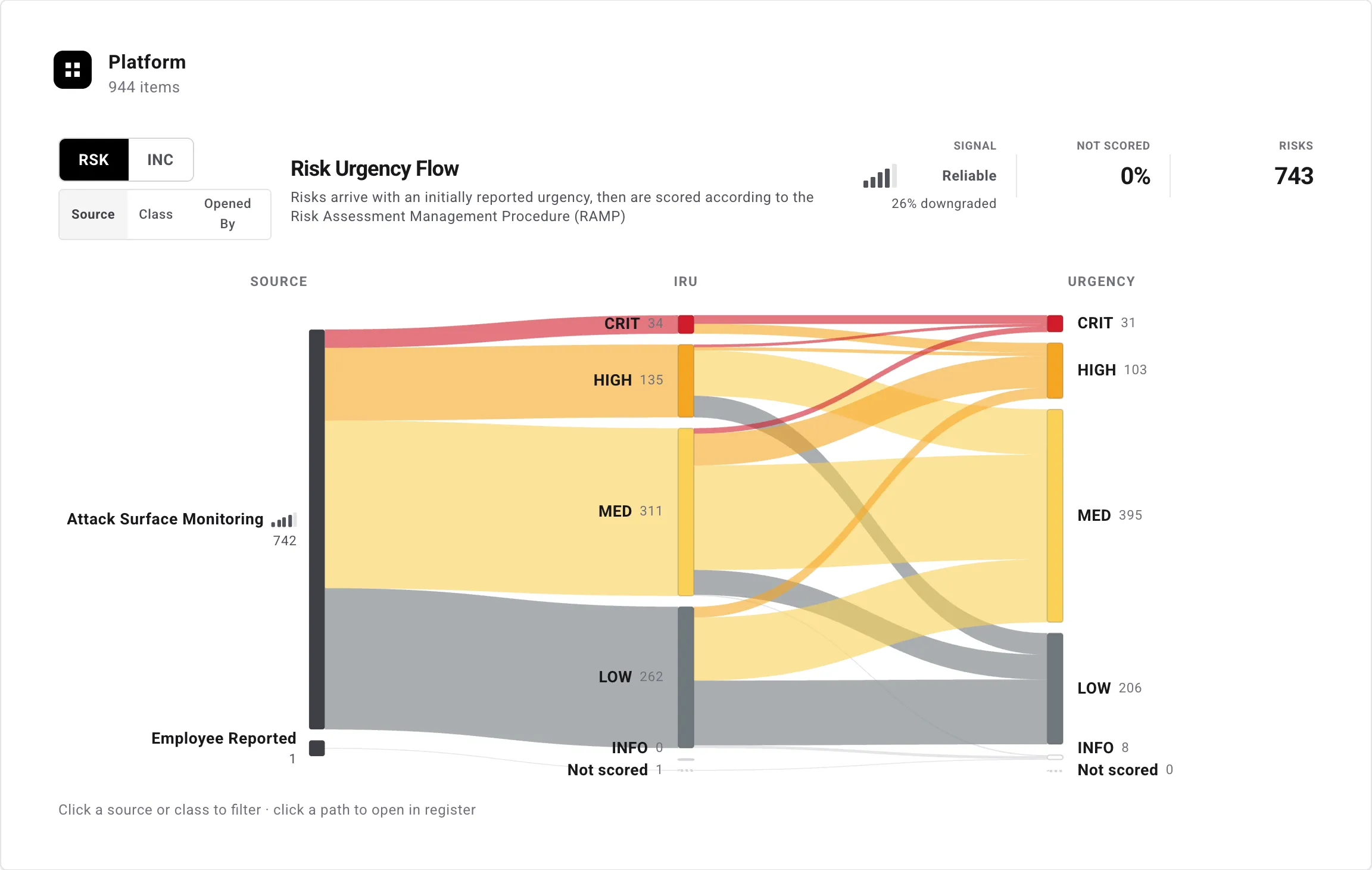
Reading the bands tells you how initial ratings hold up under triage: bands that stay level are sources whose intake ratings are accurate, downward flows are risks downgraded after review, and upward flows are risks whose urgency was raised on investigation.
The summary tiles above the chart quantify this at a glance — hover any tile for a description of exactly what it measures:
- Signal — a signal-quality gauge rating how well the initially reported urgencies hold up under scoring. The meter bands the downgrade rate — the share of risks scored on both ends whose final urgency landed below the reported one — reading Very Reliable (20% or less downgraded), Reliable (20–40%), Mixed (40–60%), Noisy (60–80%), or Very Noisy (over 80% downgraded). The percentage under the meter is that downgrade rate; lower means reported urgencies can be taken at face value.
- Not scored — the share of risks discovered in the selected range still awaiting a final urgency: their Likelihood and Impact have not both been scored yet.
- Risks — the total number of risks discovered in the selected range — the population the flow charts.
Incident Severity Flow
Section titled “Incident Severity Flow”Incidents arrive with no severity, then are scored according to the Cyber Incident Response Procedure (CIRP). The Incident Severity Flow traces each incident from its Source to its assigned Severity (SEV-1 through SEV-5), with incidents awaiting a rating shown in a Not scored band.
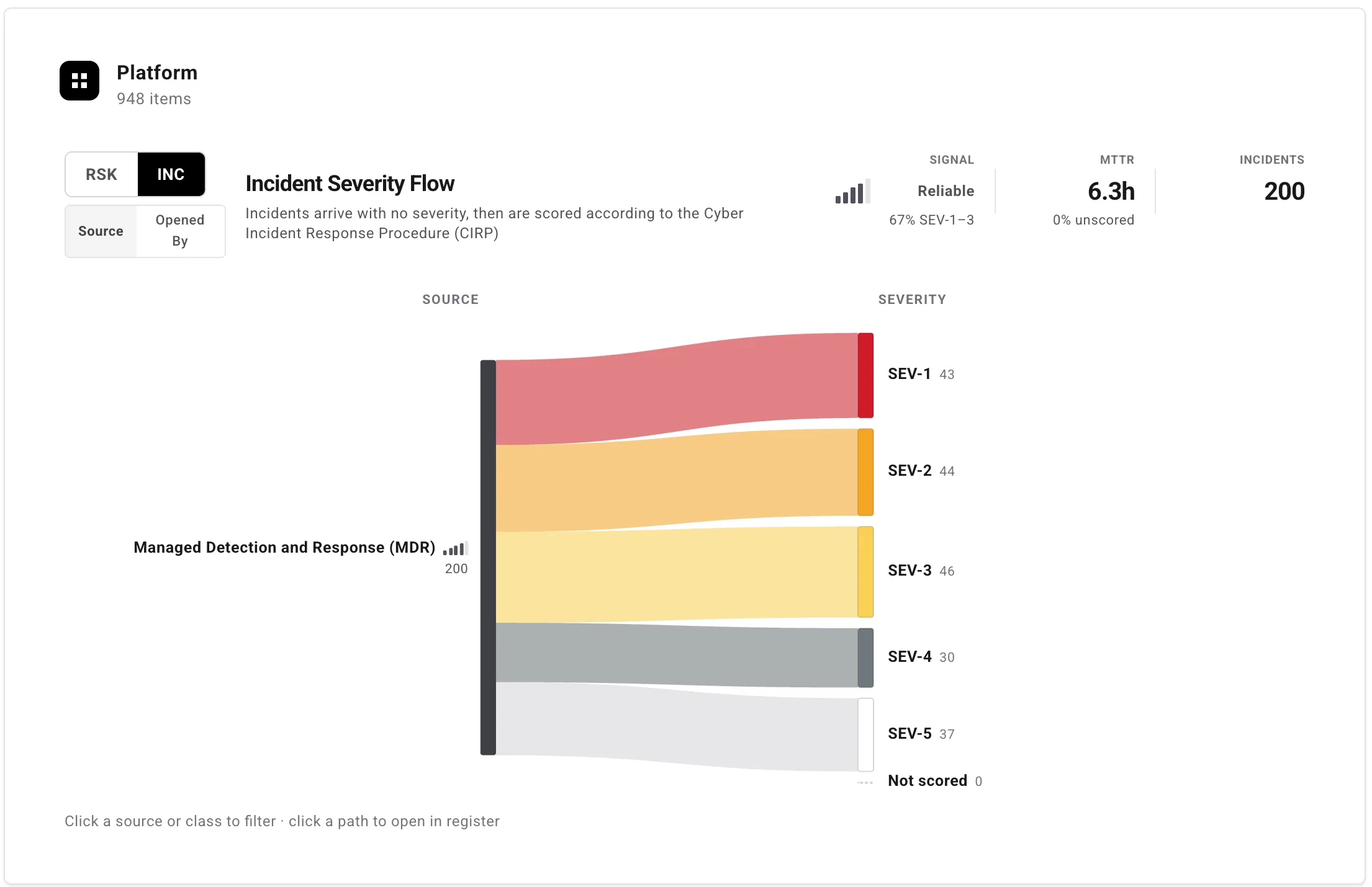
Its summary tiles mirror the risk view:
- Signal — a signal-quality gauge rating how often incidents prove serious once triaged. The meter bands the share of scored incidents assessed as serious (SEV-1–3), reading Very Reliable (80% or more serious), Reliable (60–80%), Mixed (40–60%), Noisy (20–40%), or Very Noisy (under 20% serious — mostly low-severity noise). The percentage under the meter shows whichever severity band — serious (SEV-1–3) or low (SEV-4–5) — holds the majority.
- MTTR — the mean time to respond for the incidents in the flow, measured the same way as on the Incidents summary card. The unscored caption beneath it is the share of incidents detected in the selected range not yet assigned a severity.
- Incidents — the total number of incidents detected in the selected range — the population the flow charts.