Governance Reports
The platform serves as the nerve center for governance reporting: an on-demand compliance report populated with live operational data. The report surfaces shifts in threat profile, risk posture, incident activity, and remediation performance—without manual data reconciliation or drowning leaders in evolving cybersecurity jargon and tool categories. Generated directly from the system of record, the report is delivered as an editable PPTX file across a configurable time horizon and scope. It clearly communicates inherent risk, residual exposure, and the effectiveness of the organization’s response over time.
Generate Reports
Section titled “Generate Reports”Within the Governance section of the Compliance module, select + New Report to open the report generator.
- Title — defaults to a name generated from the reporting period (for example, “Q2 2026 CyberGov Report”) and stays editable.
- Reporting Period — pick a preset (Previous quarter, Current quarter, Year to date, Month to date, Last 3 months, Last 12 months, Previous year) or set a custom date range.
- Risks (RSK): Urgencies Included — choose which risk urgency bands appear in the report. Bands don’t need to be contiguous — for example, a report can include Critical and Medium risks while excluding High.
- Incidents (INC): Severities Included — choose which incident severity bands appear in the report.
- Include tables — add the full Risks and Incidents tables for the selected bands, independently for each register.
- Include child risks / Include child incidents — fold linked child records into the report’s tables and charts alongside their parents, independently for each register.
- Tags — scope the report to only items carrying at least one selected tag.
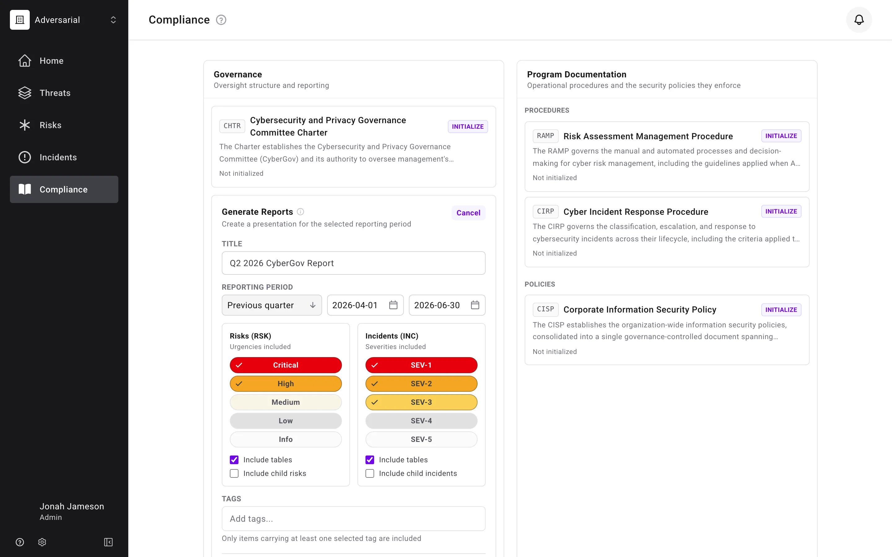
By default, the report includes Critical and High risks alongside SEV-1 through SEV-3 incidents — matching the thresholds used by the former CyberGov Report. Every slide in a generated report reflects a single consistent snapshot of your data, so numbers can’t shift mid-report if a risk or incident changes while the report is being generated.
Reports generate in the background: after you select Generate, a status chip tracks the report’s progress, and the finished PPTX downloads automatically when it’s ready — you can keep working, or navigate away, in the meantime. Past reports are listed on the Generated Reports shelf alongside the report generator, so a report can be downloaded again later without regenerating it.
What each slide shows
Section titled “What each slide shows”| Slide | What it shows |
|---|---|
| Module overview | The report’s opening snapshot of the core modules for the reporting period |
| Executive Summary | An AI-written narrative of themes and changes across threats, risks, incidents, and compliance, built only from figures the platform computed — see Executive Summary |
| Threat Profile | Your organization’s threat profile heat map, with arrows marking objectives whose score moved during the period — see Threat Profile slide |
| Risk Management | The Remediation Agility chart for the selected urgency bands, alongside the risk overview card (Opened, Closed, Remediation v. SLA, with trend sparklines) and an AI-written summary of remediation performance — see Risk Management |
| Incident Management | The rolling incident chart for the selected severities, alongside the incident overview card (Opened, Contained, MTTR) and a narrative of detection and containment — see Incident Management |
| Risk and incident tables | The full registers for the selected bands, grouped by status, when Include tables is enabled for that register — see the inclusion rules for risks and incidents |
| Compliance | A summary of policy changes during the period, with editable sections for attestations and TPRM activities managed outside the platform |
| Flow appendix | Two Sankey-style slides — the Risk Urgency Flow and the Incident Severity Flow — showing how the period’s records moved from source through intake rating to final score, see Flow Appendix |
| References | One row per figure cited in the narratives, each linking to the register filtered to exactly the records behind it — see Where the numbers come from |
Threat Profile slide
Section titled “Threat Profile slide”The Threat Profile slide renders your organization’s threat profile heat map. If a threat objective’s score changed during the reporting period, an arrow shows the movement from the previous position to the current one. Objectives that did not change during the period show only the current position.
Executive Summary
Section titled “Executive Summary”The Executive Summary is generated by AI. It takes threat profile data, risk metadata, and incident metadata from the reporting period and produces narrative summaries for threats, risks, incidents, and compliance. See AI Features for details on how AI is used in governance reporting.
Every number the summary states — how many risks were discovered, how many closed, how many incidents were detected or contained, how many were overdue at the period’s end — is a figure the platform computed for the reporting period and handed to the AI, never a number the AI counted or estimated itself. Each is also listed in the References appendix with a link back to the register.
Where the numbers come from
Section titled “Where the numbers come from”The final slide of every report is a References appendix: one row for each figure cited in the Executive Summary and in the risk and incident slide narratives, with the section it appeared in, the claim as written, and an Open in ARM link. Following the link opens the risk or incident register in the platform filtered to exactly the records behind that number — the same reporting period, the same urgency or severity bands, the same tags and child-record setting the report was generated with — so a reader can verify any figure against the live register in one click.
Two kinds of scope ride along on these links that the register’s own filter controls do not offer:
- Report-period scope — a link to an “in scope” or “overdue” figure selects the risks the report describes for the window: discovered inside it, closed inside it, or falling due by its end and not closed before it started. This is the same set the Remediation Agility chart and the risk table draw from, and it is wider than a Discovered Date filter — a risk discovered a year ago that fell due inside the period is included.
- Overdue as of an instant — a link to an “overdue at period end” figure shows the risks that were past their due date at the period’s closing instant, so the register reflects the position as it stood then, not as it stands today. For a period that is still running, the instant is the moment the report was generated.
Both persist with the register like any other filter, so navigating away and back keeps the report’s scope until you clear it with Revert.
Figures that the register has no way to display — for example, how many risks became overdue during the period, or how many were carried open into it from before — are stated in the narrative as plain text without a link. Every linked figure is one the register can show exactly.
Risk Management
Section titled “Risk Management”The Remediation Agility (RemAgi) chart is the primary risk slide in the generated report. It illustrates how effectively your organization reduces residual risk over time through a rolling twelve-month view of the risks in the urgency bands you selected, opened and closed each day, aligned to their Service Level Agreements (SLAs). The view ends shortly after the reporting period; if the period is longer than twelve months, the chart widens to cover the whole of it.
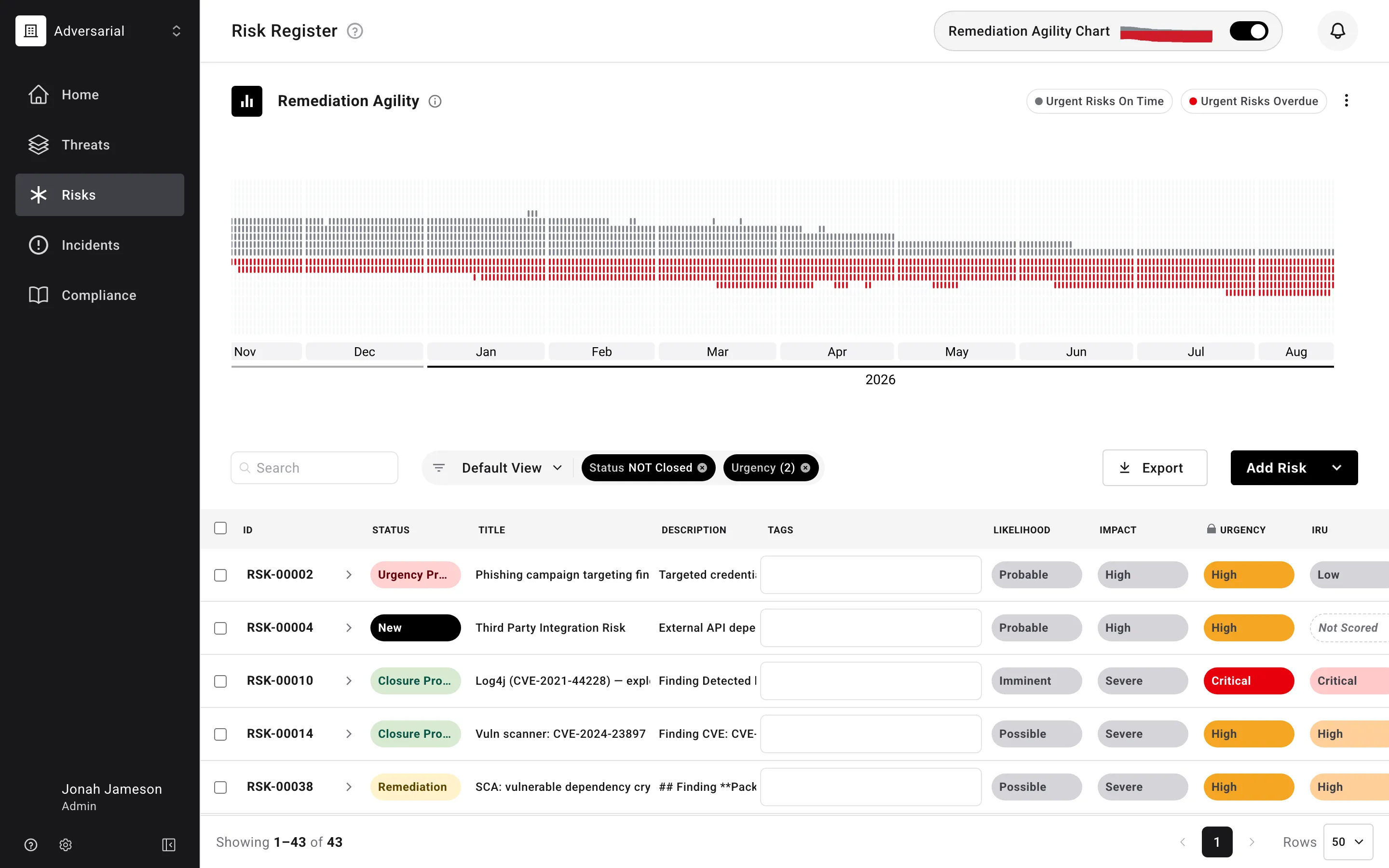
A risk’s due date is determined by its assigned urgency, which maps to the applicable SLA — administrators can adjust each urgency’s SLA window in Settings > Risks. The chart is driven by Discovered Date, Due Date, and Closed Date; Urgency determines which risks are in scope and sets each risk’s Due Date. A risk’s status does not affect the chart. Each column is a daily snapshot of the risk register:
- A gray point represents an open risk still within SLA.
- A red point represents an open, past-due risk.
A risk appears in each day’s column while it remains open.
The RemAgi chart elevates the conversation to realized remediation outcomes—reducing the noise of granular findings and helping senior leadership and the Board focus on whether High vs. Critical classifications are appropriate, whether SLAs are meaningful, and what factors may be driving delays (for example, resource constraints, code freezes, vendor dependencies, or recent M&A with uncertain posture). Within the generated report, a reporting-period callout highlights on-time (gray) versus overdue (red) activity for the current cycle, while the full-year view shows sustained risk identification and remediation over time.
Risks included in the report tables
Section titled “Risks included in the report tables”A risk appears in the report’s risk table if any of the following conditions are met:
- Discovered and currently open during the reporting period
- Discovered and closed during the reporting period
- Due during the period (due on or before the period end, and either still open or closed during/after the period)
- Discovered outside the period but closed during the period
Risk overview card
Section titled “Risk overview card”The risk slide’s card reports Opened (risks with a Discovered Date inside the reporting period, whether or not they have since closed), Closed (risks closed inside the period), and Remediation v. SLA — the average share of the SLA window consumed across risks closed in the period plus every risk still open at its end, whenever discovered. Each is shown against the immediately preceding period of the same length. The card uses the same definitions as the Home dashboard’s Risks card and is scoped to the urgencies, tags, and child-risk setting you selected for the report, so it reconciles with the tables, chart, and narrative on the same slide, and with the dashboard for the same period and urgencies.
Incident Management
Section titled “Incident Management”The Incident chart is the main incident slide in the generated report. It provides a rolling 365-day view of incident reporting and shows how effectively your organization is detecting and containing incidents, scoped to whichever severities you selected under Severities Included when generating the report.
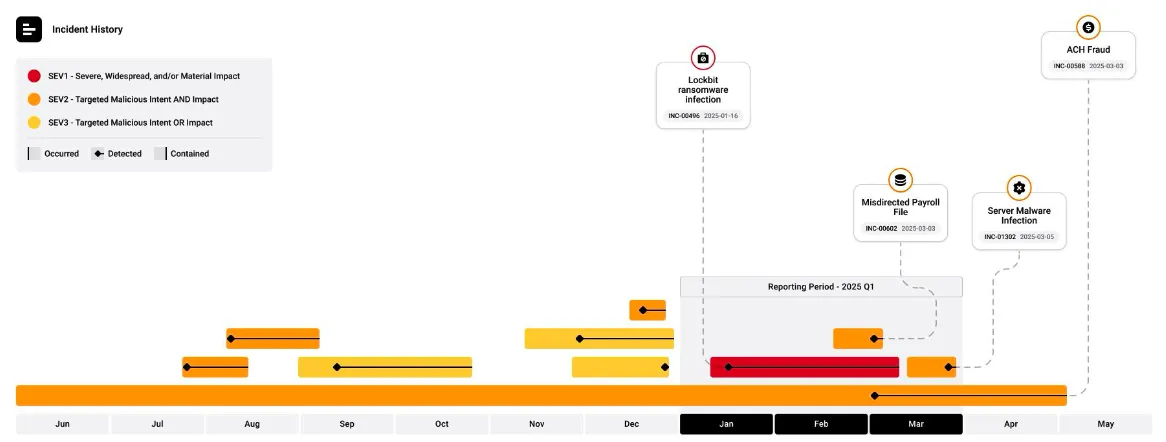
The chart is driven by the fields Severity, Occurred Date, Detected Date, and Contained Date. For each incident, the chart makes visible when it occurred, when it was detected, and when it was contained. Within the generated report, a reporting-period callout highlights incidents for the current cycle, while the full-year view shows consistent incident identification and containment across the year. Callout information includes the Threat Objective, Title, INC ID, and Detected Date. The color around the Threat Objective (red, orange, yellow) aligns with the assigned severity level.
Incident overview card
Section titled “Incident overview card”The incident slide’s card reports Opened (incidents with a Detected Date inside the reporting period, whatever their status now) and Contained (incidents contained inside the period), each against the immediately preceding period of the same length, plus mean time to respond. These are the same definitions the Home dashboard’s Incidents card uses, over the severities, tags, and child-incident setting you selected for the report.
Incidents included in the report tables
Section titled “Incidents included in the report tables”An incident appears in the report’s incident table if any of the following conditions are met:
- Detected date falls within the reporting period
- Occurred date falls within the reporting period
- Contained date falls within the reporting period
- Detected or occurred before the reporting period and still uncontained at the period’s end (ongoing incidents)
The charts cover the full twelve-month view rather than the reporting period, so they also show activity from before it; the reporting-period callout marks the current cycle.
Flow Appendix
Section titled “Flow Appendix”The report’s appendix renders the same Sankey-style flow diagrams the Home dashboard shows — one slide for each register, covering the reporting period:
- Risk Urgency Flow — traces the period’s risks from their Source through the Initially Reported Urgency they arrived with to the Urgency they were ultimately scored at, making visible where intake ratings held up and where they shifted once risks were actually scored.
- Incident Severity Flow — traces the period’s incidents from their Source to the Severity they were assigned, showing which intake channels drive the serious incidents.
These give report readers the same signal-quality picture operators see on the dashboard — how much triage changes what the sources report — without leaving the deck.